Apple's Liquid Glass UI in iOS 26: A Beautiful Shift That’s Not Without Controversy
Apple just unveiled a major visual update across all its platforms — and it’s turning heads. With the introduction of iOS 26, alongside iPadOS 26, macOS Tahoe 26, watchOS 26, and tvOS 26, Apple is rolling out a new design philosophy centered around a material they call Liquid Glass. It’s elegant, immersive, and undeniably Apple — but not everyone is applauding.
So, what is Liquid Glass exactly?
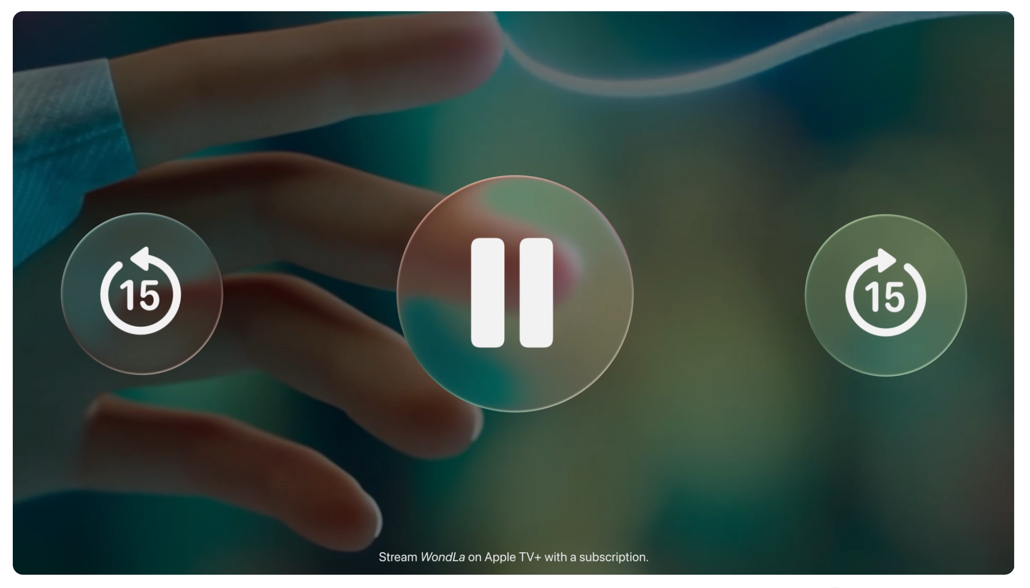
At its core, it’s a translucent design layer that behaves like real-world glass — reflecting, refracting, and even morphing based on what’s around it. Think of it like a UI that breathes and bends light, dynamically shifting with the content and context. From sliders and switches to full tab bars and sidebars, Liquid Glass reshapes the entire feel of apps, making them appear deeper and more alive.
Apple’s VP of Human Interface Design, Alan Dye, calls it the company's “broadest software design update ever.” And it certainly feels that way. Every corner of the OS, from Control Center to the Lock Screen, now echoes this fluid, expressive material. Apps like Safari, Camera, Photos, and FaceTime have all received refreshed looks that better align with the updated aesthetic.
Even the smallest details — the time on your Lock Screen, the shadow beneath an icon, or the edge of a sidebar — now flow with this new visual rhythm. On the Mac, for example, widgets and app icons in macOS Tahoe 26 look like they're made from layered glass, catching light and adapting to your wallpaper or environment.
The Good — and the Not-So-Good
Designers and UI enthusiasts have been quick to experiment with Liquid Glass-inspired aesthetics. It’s a playground for gradients, blur effects, and depth. But despite the excitement, the design hasn’t been universally praised.
Some users and accessibility advocates are raising concerns — particularly about readability on light backgrounds. While the Liquid Glass material is beautiful, its transparency and light refraction can reduce contrast in certain settings, making text or icons harder to read. In an OS where clarity and speed are essential, this could be a real issue for users with low vision or cognitive difficulties.
Still, for many, this new aesthetic is a breath of fresh air — a way to bring more harmony between hardware and software, while making interfaces feel more personal and expressive.
Creative Interpretations of Apple’s New Liquid Glass Design
Inspired by Apple’s bold design shift, I’ve gathered 10 beautiful Liquid Glass-style UI concepts that showcase just how creative this design language can be. From mobile app dashboards to desktop widgets and browser UI, these examples embrace the translucent, fluid, and layered aesthetic Apple just made mainstream.
Whether you’re a designer looking for inspiration or just someone who loves clean, elegant visuals — these designs are guaranteed to impress.
My version of liquid glass.
— Ata (@theatashka) June 11, 2025
What do you think about it? pic.twitter.com/sCcOzuwRx0
I think I've found a quite nice trick to recreate a little lens distortion effect in @figma to replicate the Liquid Glass material.
— Max (@Aximoris) June 10, 2025
Find a little tutorial below ⬇️ pic.twitter.com/cqZJskLpwL
💧How to make Liquid Glass Effect in Figma
— Camden @ Designownow (@Designownow_) June 10, 2025
-
Supafast tutorial, lets go! :🧵 pic.twitter.com/nfpDH80WfO
Finally able to reveal what I've been working on for the past year... j/k, here is a quick Liquid Glass implementation in JavaScript using WebGL and several hacks.
— Armagan Amcalar (@dashersw) June 12, 2025
Enjoy!https://t.co/mNJT72wkzj pic.twitter.com/iMuLIYni4l
Liquid glass in Figma is here.
— Brett (@BrettFromDJ) June 10, 2025
Full breakdown & Figma file provided below. pic.twitter.com/PlwjIqiGwP
How to create liquid glass effect in @figma
— Andriy Boichuk (@andriy_uiux) June 11, 2025
🫠 pic.twitter.com/dkQ3TDn20B
My attempt at liquid glass. Made in @figma.
— Mária Savkaničová (@Marki_Tweet) June 11, 2025
Yeah, it's quite hard to make it accessible while keeping the "liquid" effect. pic.twitter.com/GoyBl4H8Dc
A quick experiment on liquid glass. Not quite the thing, but also not done in Figma. #apple #WWDC25 pic.twitter.com/7Xmq5hgLzS
— David Mendes (@ideasondesign) June 9, 2025
Ok, figured out the proper Liquid Glass Effect!
— Andre | Formfactor Design (@andremflores) June 11, 2025
... not just the frosted glass one that some have pointed out on the mockup.
And yes, this is on Figma. https://t.co/SaG0b23fnr pic.twitter.com/UaT5uX05Bd
okay fine, I will publish a react package for liquid glass
— Max Rovensky (@MaxRovensky) June 10, 2025
improved the refraction a bit since morning (even supports different "modes" now) and added elasticity so it feels more ✨ liquid ✨ https://t.co/4iYXssiaxe pic.twitter.com/HUFkbZfx5T
Recents pic.twitter.com/rORx1M6JLC
— Wojciech Zieliński (@zielinskiwoj) June 17, 2025
See the Pen Liquid Glass by Mike Bespalov (@Mikhail-Bespalov) on CodePen.
See the Pen Apple Liquid Glass UI (2025) by Avaz Bokiev (@samarkandiy) on CodePen.